In Febraury of 2013, I completed work on the-beautiful-table.com (now defunct).
What follows is a discussion of the motivation and process behind the site...
We design to fulfill a need, to make things efficient and usable, and to make things beautiful. New discoveries, especially in technology, allow us to improve on existing designs. So it is important to evaluate and question current forms of design and ask ‘are we providing the best solution given the tools available?’
Several months ago, I began to ask this question about one of my passions: football (‘soccer’ to us yanks). I wondered if how we communicate basic football information such as standings, results, and schedule could be improved through design. So with a sketchbook and Macbook in hand and Tufte’s sage words on my mind, I went to work.
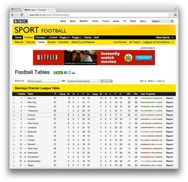
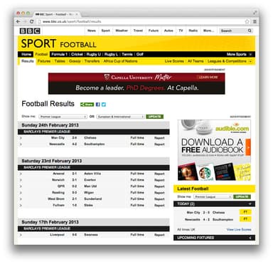
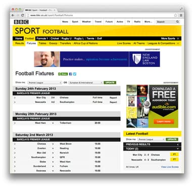
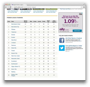
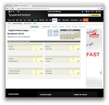
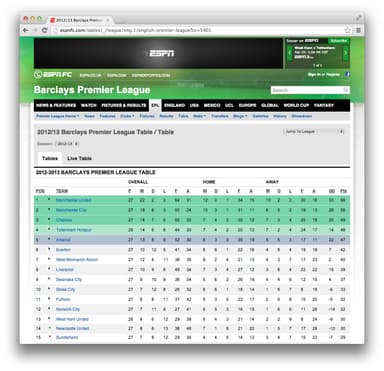
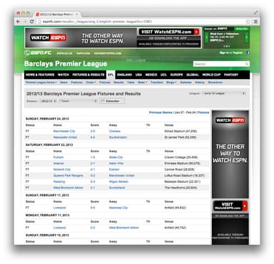
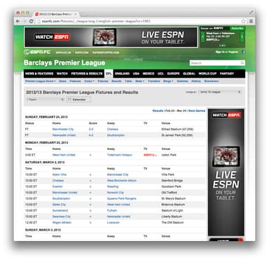
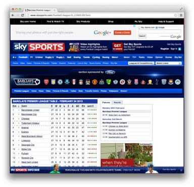
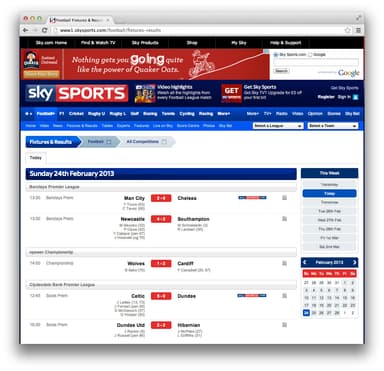
Several online sources separate standings, results, and fixture data, requiring viewers to navigate several pages to answer questions and making it hard to identify trends in the data.
- Provide football standings, results, and schedule as one cohesive work.
- No data loss when compared to existing designs.
- Reveal additional information in an obvious way.
- No visual treatment for the purpose of aesthetics only. Visual treatments must be essential.
Step 1
The initial sketch ordered clubs vertically from first to last. Each match is laid out horizontally with home goals on top and away goals on bottom.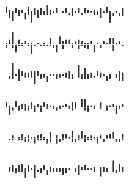
Step 2
Losses and draws are given lower opacity, less visual weight. This allows the viewer to identify match trends such as winning and losing streaks.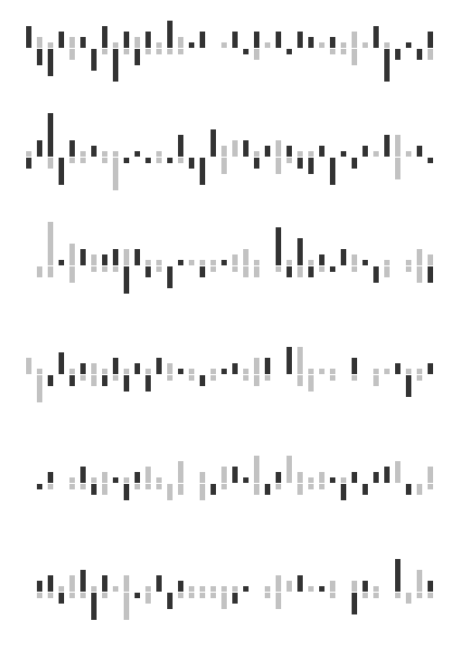
Step 3
Nil-nil draws are represented as 1 pixel lines (see row three column one).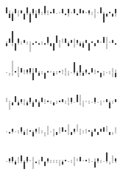
Step 4
Draws are given more weight to differentiate from losses. Points correspond to visual weight. Win, 3 points, solid black; draw, 1 point, dark grey; loss, 0 points, light grey.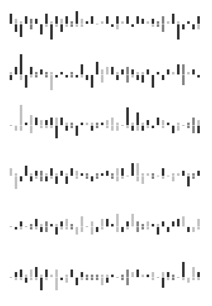
Step 5
Goals are represented with rounded-sm bars instead of rectangles which echoes the shape of the ball.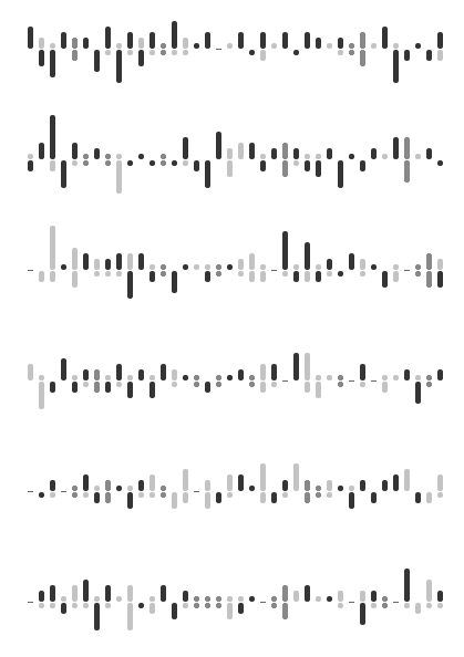
Step 6
Club color is added to correspond to its goals.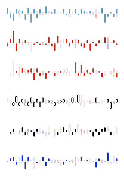
Step 7
Goal/match size is increased for legibility.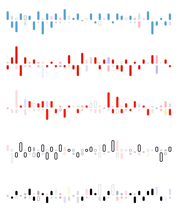
Step 8
Club crests are added to further indentify the club’s matches.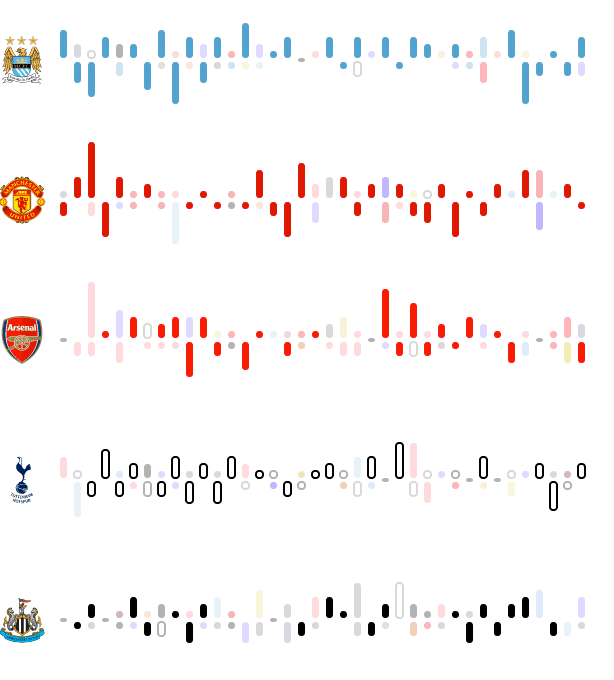
Step 9
Clubs with a primary color of white (see row 4, Tottenham) now use the club’s secondary color. This removes the need for using a stroke around the goals and increases consistency with the goal treatment of other clubs.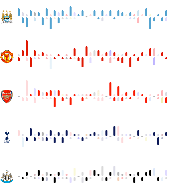
Step 10
Club color is added to nil-nil draws.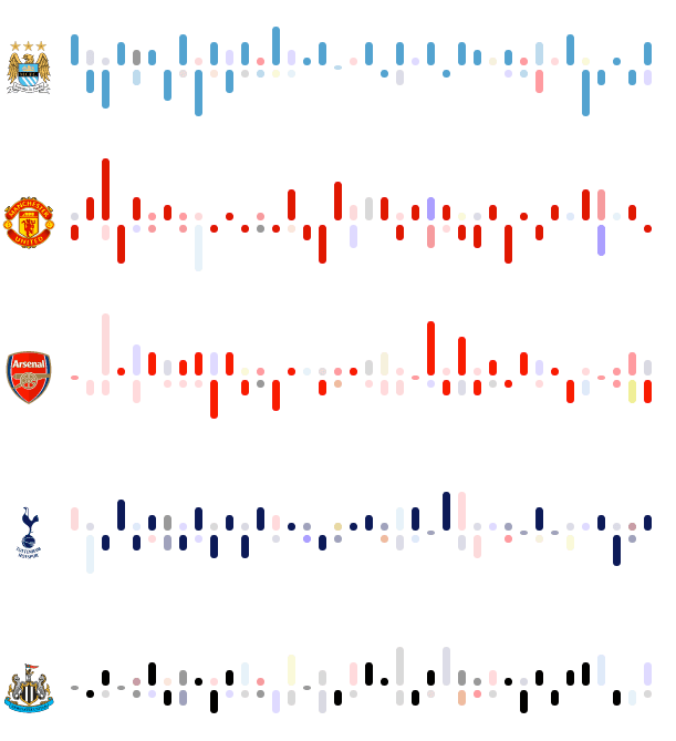
Step 11
Goal/match size is increased in preparation of match details.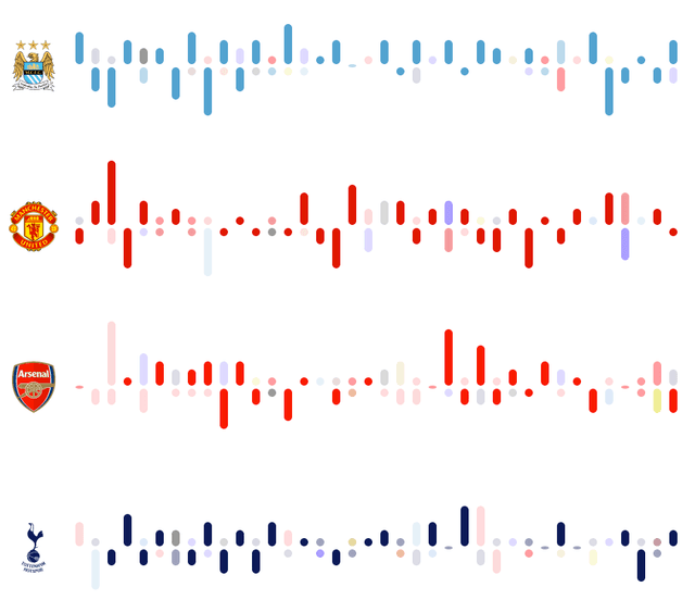
Step 12
Club points totals are added.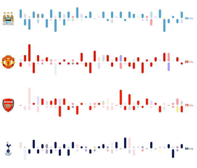
Step 13
Club points details (wins, draws, losses, and goal differential) are added on mouseover or click.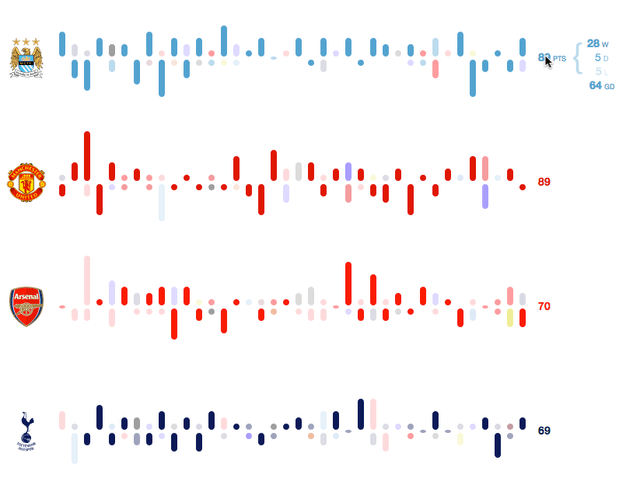
Step 14
Scheduled games are added. This adds a representation of the club’s progress within the season.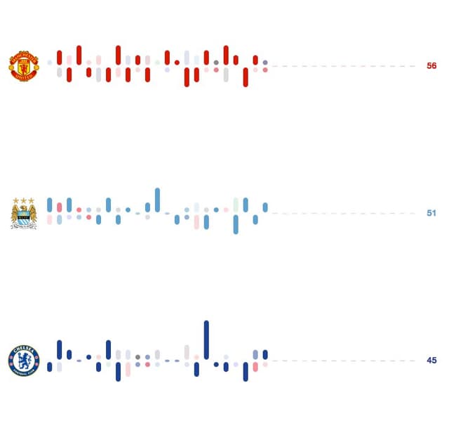
Step 15
Match details (team names, goal scorers, time of goals, and kickoff time) are added on mouseover or click.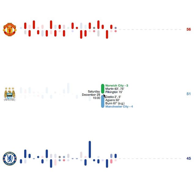
Step 16
Horizontal axis is laid out according to match kickoff time. This adds a representation of when matches were played relative to other matches.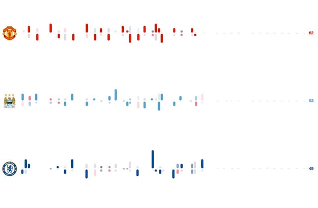


Data is gathered from several sources by manual process and entered into a MySQL database for storage. Rails delivers the data to the browser as JSON using the Jbuilder gem. The browser handles user interaction and communication with the server using Backbone.js and formats the data as SVG elements using D3.js. The application runs in Unicorn, hosted on Heroku.